Extra Credit--Map examples
There were many fun and interesting examples of maps to be found, these were among my favorite:
1)Heating degree days--this was an interesting color contour map where the red represented warmer areas and the cooler areas were in white. It was neat to follow the contour lines as well as the colors.
2)U.S. Population Density--loved the colors and the white borders of the states, not the traditional black or dark borders--it draws you into the map.
3)Federal Land Ownership--subtle use of colors but it really makes you look into the western part of the country especially.
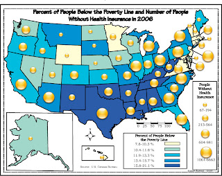
4)Tracking the West Nile Virus--a neat bivariate map that uses prism height, little difficult to interpret because of the boundaries of some of the states but interesting nonetheless.
5)Chernoff Faces Map of Health Issues in Chicago--liked this map because of the topic, the faces and the colors.
Extra Credit---Maps done by classmates
I looked over the blogs of both classes and saw many well done maps. These five were among my favorites:
1)dot density by CMackey--I liked this one because it was unusually stimulating with the added background color.
2)bivariate by LParker--In her map, Number of Orchards vs. Land Area I liked the colors she used to represent land infoormation and the symbol of the tree, especially this time of year. The trees look like they are planted in the land.
3)Total Housing Units in Maryland by AHunsberger--The placement of the houses in each county made it easy to read and I liked the fact that as the houses got bigger they looked more like mansions.
4)Illustration of the Sphere etc. by Ryan--I know this was one of the first labs we did and it may not be as complex but I like the way the different shapes are so distinctive with the different solid and dashed lines to represent the sphere, ellisoid, geoid and natural surface.
5)dot density by Robert B--I seem to like the dot density maps!! I like the contrast in background and foreground colors. It makes West Virginia really stand out--looks crisp.
Color choropleth
Dot density
Grayscale choropleth
Typography
Subscribe to:
Comments (Atom)


